獲獎記錄 Awards
獲得國際肯定
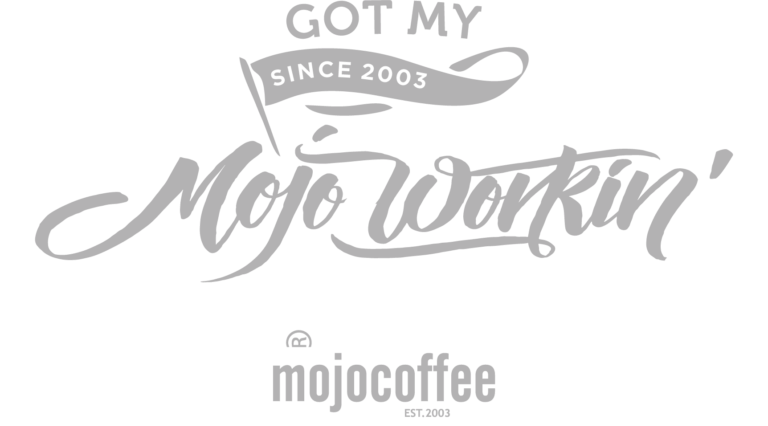
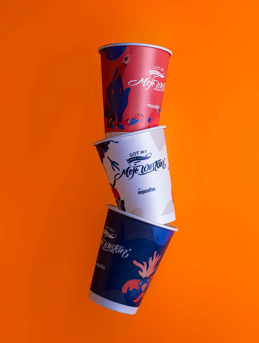
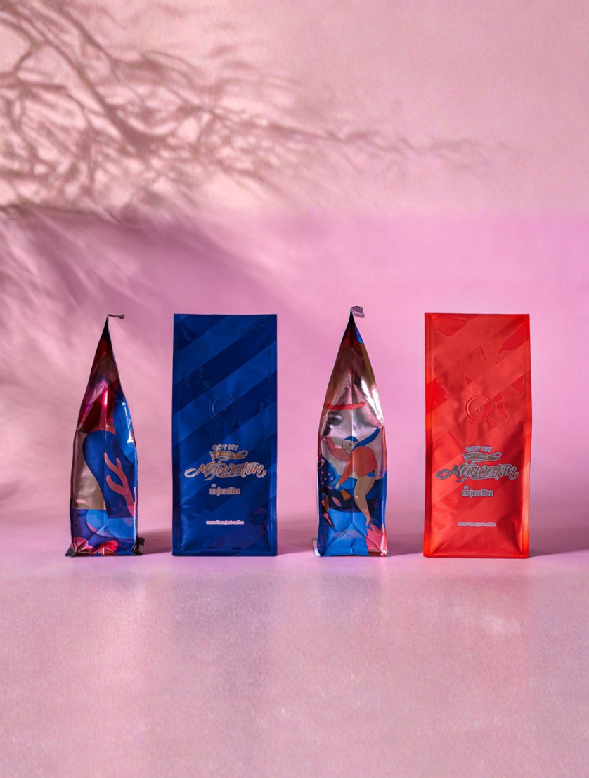
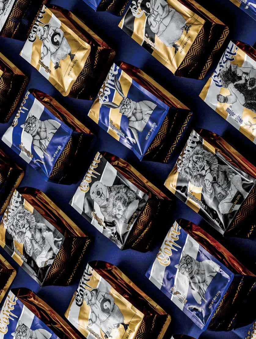
mojocoffee 零售包裝設計視覺化了非裔美國人的傳統:當遇到困境時,他們會去找巫毒術士尋求能保護他們的「mojo」護身符。
基於藍調歌曲《Got My Mojo Workin'》,包裝傳達了咖啡在現代社會也能扮演 mojo 的角色。
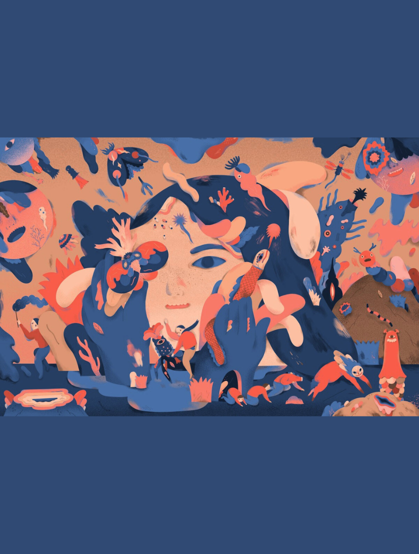
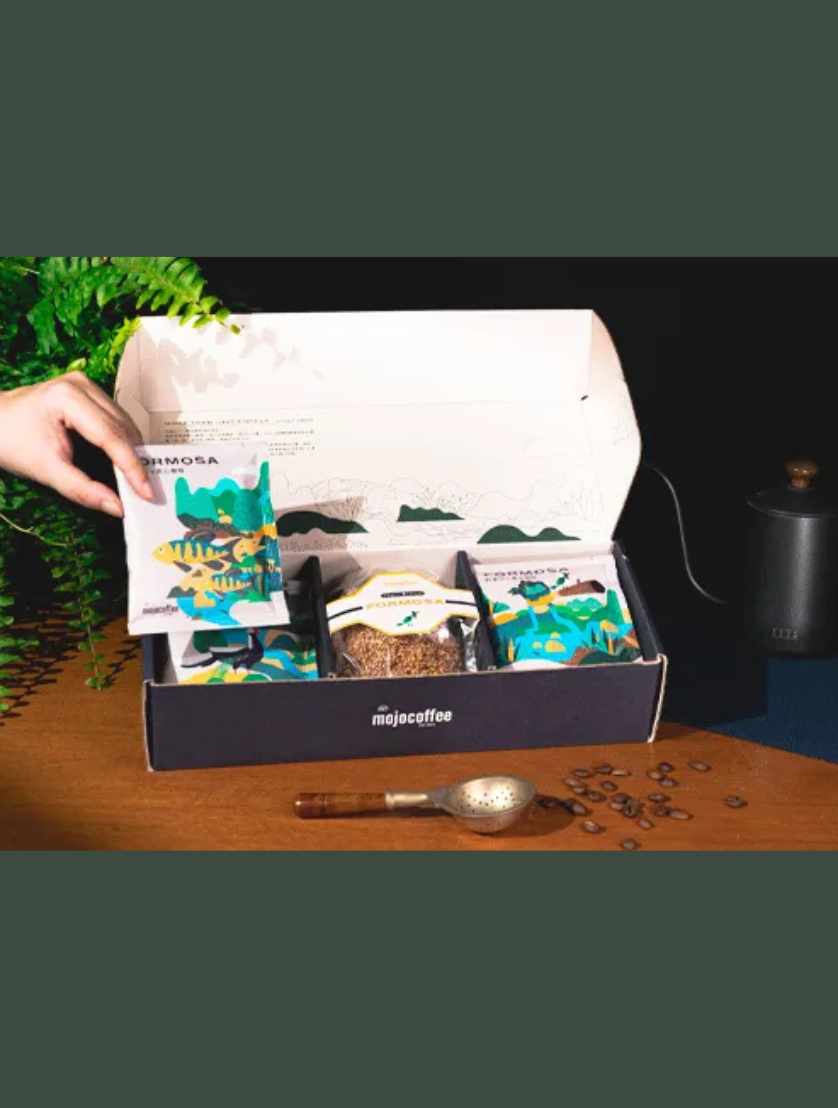
正面的同名標語採用局部上光印刷創造層次效果,側面則以超現實插畫分割成八塊拼圖。當四個袋子的八面拼在一起時,呈現出完整的「咖啡飲者非凡內心思想」圖像。
The "mojocoffee" retail packaging visualises the tradition that African-Americans, when in trouble, go to see a hoodoo to ask for mojo that will keep them safe.
Based on the blues song "Got My Mojo Workin'", the packaging communicates that coffee can also act as mojo in modern society.
The eponymous slogan on the front adopts spot varnish printing to create a layering effect, while the side features surreal illustrations split into eight puzzle pieces. When the eight sides of the four bags are put together, they suggest a complete image of the "coffee drinkers' extraordinary inner thoughts".
「記住,在你心中有真實的自己,你可以隨時向內探尋,找到真實的自我。」
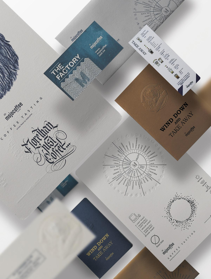
我們呈現 mojocoffee 獨立的企業形象;一間致力於精品咖啡與舒適環境的咖啡館。品牌設計創造吸引人的視覺識別,巧妙地展現一個人脫下面具,透過味覺與嗅覺發現真實自我。
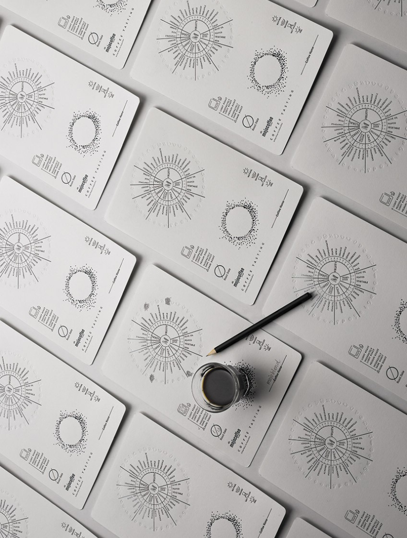
透過有趣的互動,mojocoffee 咖啡師讓咖啡飲者理解咖啡的風味。包裝上有趣的圖形和插畫,讓品牌更貼近顧客。金色和藍色代表精緻生活的享受。
"Remember that in your heart there is the real you, you can always look inside and find your true self."
We present the independent corporation image of MOJOCOFFEE; a cafe dedicated to specialty coffee and cozy environment for its customers. A brand design to create an attractive visual recognitions, a witty display of one's taking off mask to discover own self through taste and smell.
With fun interactions MOJOCOFFEE barista let its coffee drinkers understand the flavors of coffee. The fun graphics and illustrations on the packaging simply bring the brand closer to the customers. The gold and blue colors represent the indulgence of a sophisticated lifestyle.
mojocoffee 阿里山咖啡插畫與包裝設計,呈現品牌對產地、風味與視覺美學的整合思考。
設計以阿里山咖啡為核心主題,透過插畫與字體編排,將台灣高山咖啡的層次與細節轉化為具辨識度的包裝語言。整體視覺不追求裝飾,而是以清晰而富情感的方式,讓產地故事自然地被看見。
此作品於 2024 年榮獲 MUSE Creative Awards 金獎,並於 Typography-Packaging / Product 類別中獲得國際肯定,展現來自台灣的咖啡品牌在包裝設計與視覺表現上的成熟度與深度。
The Alishan coffee illustration and packaging design for mojocoffee reflects a thoughtful integration of origin, flavor, and visual identity.
Centered on Alishan coffee, the design translates Taiwan's high-mountain terroir into a distinctive packaging language through illustration and typography. Rather than relying on ornamentation, the visuals focus on clarity and emotion, allowing the story of origin to be communicated with restraint and confidence.
This project received the Gold Award at the 2024 MUSE Creative Awards in the category of Typography – Packaging / Product, highlighting Taiwan's presence in international packaging and coffee design.

關於紅點設計大獎 About Red Dot Design Award
紅點設計大獎創立於 1955 年
是全球最具指標性的設計競賽之一
聚焦產品、傳達與概念設計領域
表彰品質、創新與設計價值
象徵美學、功能與創意的國際肯定
Founded in 1955, the Red Dot Design Award is one of the world's most recognized design competitions. The award focuses on product design, communication design, and design concepts. It honors excellence in quality, innovation, and design value. Winning represents international recognition in aesthetics, functionality, and creativity.
關於 MUSE 大獎 About MUSE Awards
MUSE 大獎為國際設計競賽
涵蓋設計、品牌、包裝與視覺傳達
聚焦概念完整度與創意表現
獲獎象徵創意實力的國際肯定
The MUSE Awards is an international design competition. It celebrates design, branding, packaging, and visual communication. MUSE focuses on concept clarity and creative excellence. Winning signifies international recognition of creative strength.